Have you ever wondered about how much outlier points influence the curve fits you do in software like Logger Pro? Or, how much you can rely on measures like the slope uncertainty or the correlation coefficient as a judge of how good a line fits your data?
Way back in 1973, a statistician named Anscombe wrote a paper about the importance of actually graphing your data, and not just depending on statistical analysis. He created four sets of XY data pairs, each with identical average X, average Y, variance in X and Y, mean X and Y, linear regression slope and intercept, and even correlation coefficients and RMSE values. In other words, these data sets seemed to be about the same—until they are graphed.
Here’s what the four data sets look like, graphed in Logger Pro. We’ve added linear fits to each graph, complete with uncertainties of the slope and intercept, and correlation coefficients and RMSE values. The fit statistics are all the same, but the underlying data sets are far from the same.
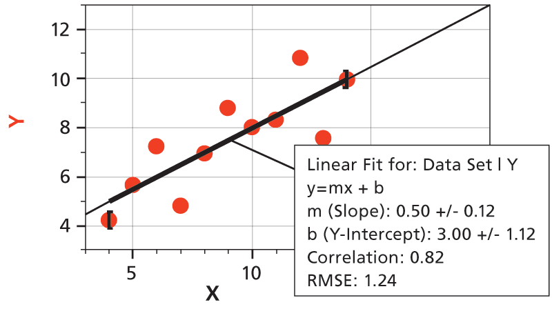
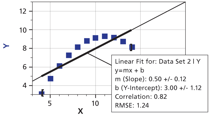
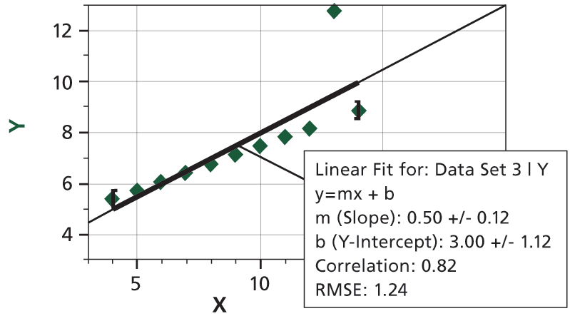
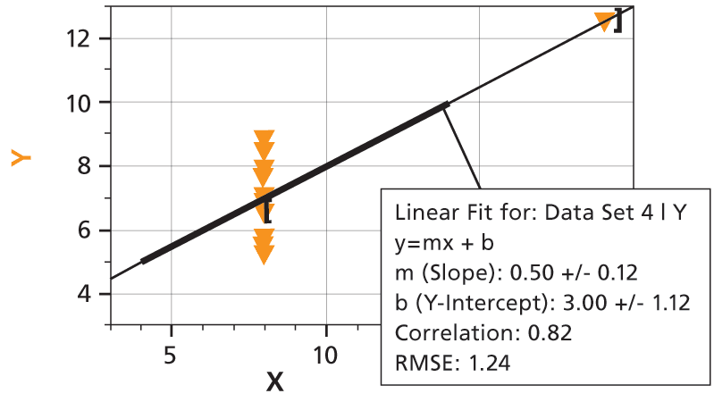
The take-home lesson: Inspect a plot of your data, and then decide if your fit means anything.
F.J. Anscombe, “Graphs in Statistical Analysis,” American Statistician, 27 (February 1973), 17-21.