Logger Pro 3.7 has an exciting new feature for use in conjunction with our new Vernier GPS Sensor. If connected to the internet, Logger Pro can export location data to Google Maps, something it has done for a while, but it can now color code a line of data from a sensor or any data column.
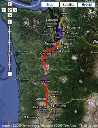
Recently, a few of us drove from our office in Beaverton, OR to Seattle, WA for a conference. We attached a Vernier GPS Sensor to a LabQuest and collected data throughout the trip. LabQuest not only records the latitude and longitude of each point, but the speed, direction, and altitude, as well. The data were imported into Logger Pro, then exported to Google Maps. In the options for this export from Logger Pro, you can now choose to plot the data as a line instead of individual points, using the color spectrum for any column. We chose speed as the column to use for color coding, with red being the fastest and violet being the slowest.
What do you think happened in the violet and blue sections? Think of ways you could use this in your physics courses. What would acceleration data look like?
Download Logger Pro file of Portland to Seattle drive GPS data »