Sharing ideas and inspiration for engagement, inclusion, and excellence in STEM
When I was teaching AP Environmental Science in Houston, Texas, one of my biggest frustrations was air quality. It’s one of the most relevant, student-facing topics in the entire curriculum—my students lived in a city with real air quality issues—and yet the tools available for actually measuring it in a classroom were painfully limited: Vaseline on a glass slide or a T‑shirt wrapped around an exhaust pipe. Creative, sure, but it doesn’t give students the kind of real‑time, quantitative data that drives genuine scientific inquiry.
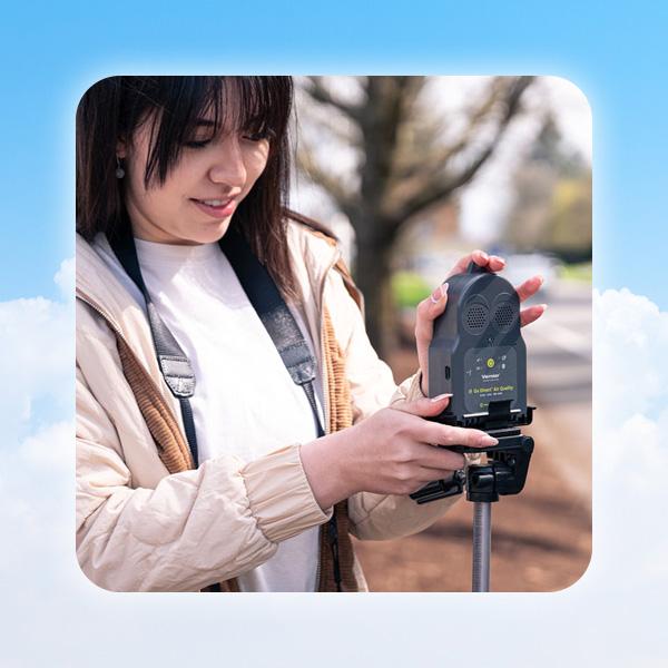
That’s exactly what the new Go Direct® Air Quality Sensor is designed to do. Whether you’re teaching high school environmental science, AP or IB courses, or an introductory college ecology or chemistry course, this sensor opens up investigations that just weren’t possible before.
Why Place‑Based Learning?
Before I get into the sensor itself, I want to make the case for place‑based learning, because it’s the philosophy behind how I think about all of these investigations.
When I taught in Houston, my students—most of them growing up in a dense, urban environment—didn’t have a strong sense of the science happening right around them. So I started getting them outside. We’d pick up trash around campus. We’d make observations. I’d ask: What do you notice? What do you wonder about? And I’d let their questions lead us toward experiments.
Here’s what I love about outdoor environmental investigations compared to traditional labs: They’re messy. You can’t control every variable. The data doesn’t always behave. And that’s the point. Showing students that that is what real science looks like—full of unexpected variables, competing explanations, and genuinely surprising results—builds critical thinking in a way that a tightly controlled lab experiment just can’t.
It also builds environmental literacy. Students who have measured the air outside their school, or tracked CO₂ levels in their own classroom, have a personal connection to those issues that they will remember.
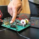
Meet the Go Direct Air Quality Sensor
The Go Direct Air Quality Sensor has 15 channels that measure
- Particulate matter (PM1, PM2.5, PM10)
- CO₂, NO₂, SO₂, and ozone
- VOC index (a 0–500 scale that works a bit like an electronic nose—100 is your baseline, and spikes indicate odor-causing compounds)
- Temperature, relative humidity, barometric pressure, and station pressure
- GNSS (GPS) latitude, longitude, and altitude for geotagging data
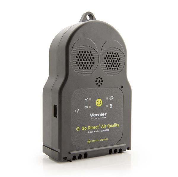
It connects via Bluetooth® wireless technology or USB to any device—Chromebook™, iPadOS®, Windows®, MacOS®, Android™—using the free Vernier Graphical Analysis® app. It also supports remote data logging, so you can set it up somewhere, walk away, and retrieve the data later. One sensor can run for 24 hours on battery, and much longer when connected to a USB power source.
It ships with a lanyard, a tripod-compatible mount, and a set of lab activities including both AP‑style inquiry investigations and NGSS‑aligned experiments:
- Using the Sensor: Learn different channels, remote data collection, and basic analysis.
- Indoor Air Quality Investigation: Analyze indoor air quality data and develop recommendations to improve it.
- Traffic and Outdoor Air Quality: Investigate how vehicle traffic influences air pollution.
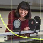
Three Inquiry Explorations with Sample Data
One of the things I love most about this sensor is that it turns everyday curiosity into a legitimate scientific inquiry. While I was developing and testing it, I found myself collecting data everywhere—my kitchen, my home office, across nine locations in the LA basin, on an airplane. None of these were formal experiments. They were just questions I had about the world around me, and the sensor made it easy to chase them down.
That’s exactly the kind of thinking I hope this sensor unlocks for you and your students. Here are a few of my explorations, with sample data, to spark some ideas.
Exploration 1: Indoor Air Quality and Cooking Emissions
It turns out your kitchen is a great place to start investigating air quality. Gas combustion, high-heat cooking, and even everyday activities like toasting bread all produce measurable changes in particulate matter, CO₂, and VOC levels—changes students can immediately connect to their own lives.
Set up the sensor in a kitchen or lab space and establish a baseline reading. Then introduce a cooking source—a gas burner, a hot plate with oil, or a toaster—and observe how each parameter responds in real time.
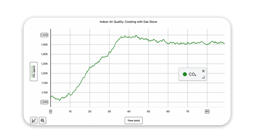
I collected air quality data while cooking a steak dinner on my gas stove at home. You can see the ambient CO₂ reading (a little high since it was indoors in winter) and then CO₂ spiking as we turned the stove on and began cooking around 10 minutes in.
Gas combustion produces a rapid, visible increase in CO₂. High-heat cooking—especially pan-frying—drives sharp spikes in PM1, PM2.5, and PM10 as fine particles become airborne.
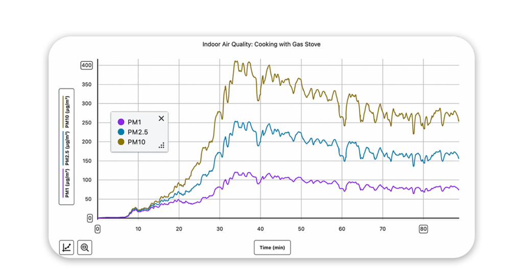
The same dinner, now showing the PM1, PM2.5, and PM10 channels. Once I started pan-frying the steak and mushrooms in a cast iron skillet, all three particulate readings spiked sharply.
From here, the investigation has a lot of natural directions: Does ventilation—opening a window or turning on a range hood—bring levels back down? How quickly? How do different cooking methods compare? What does that mean for people in homes without good ventilation?
Exploration 2: Indoor vs. Outdoor Air Quality—Open a Window, But Should You?
Ventilation is the standard advice for improving indoor air quality—but the data reveals a more complicated picture. This investigation asks students to examine that assumption directly.
Start with the sensor indoors, window closed, and allow a baseline to establish. Then open the window and observe what changes—and what doesn’t.
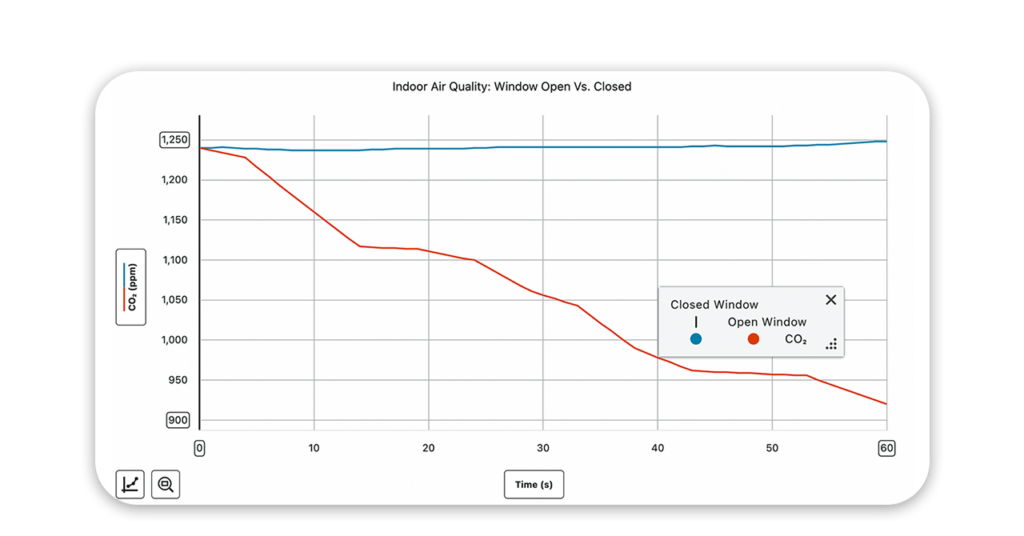
I measured indoor CO₂ levels with the window closed to establish a baseline, then opened the window. You can see CO₂ dropping almost immediately as fresh air comes in.
CO₂ drops almost immediately with ventilation, as expected. But particulate matter often tells a different story:
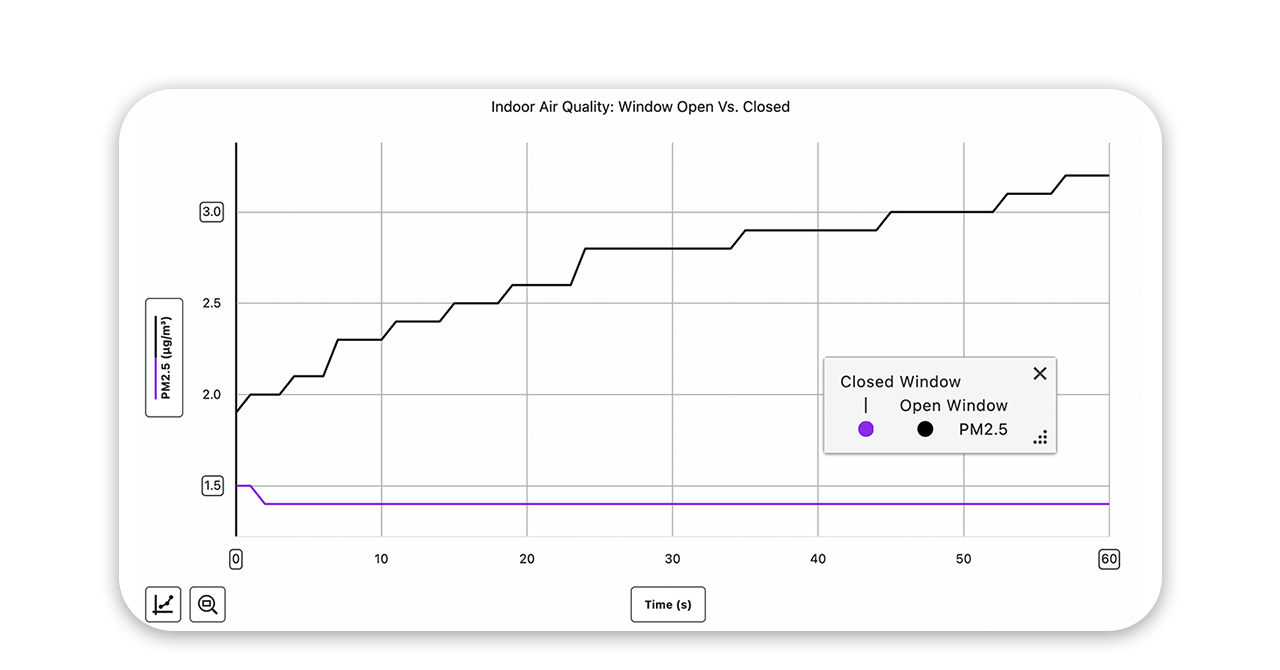
In the same session, I saw PM2.5 rise as soon as I opened the window.
As outdoor air enters, PM levels frequently rise—pollen, dust, and traffic-related particles coming in through the window. Students are trading one air quality concern for another, which is genuinely surprising and not at all what most expect.
This sets up productive scientific argumentation: Is the air better or worse after opening the window? How do you define “better”? What does the answer depend on?
Exploration 3: Measuring Across Locations—From the LA Basin to 30,000 Feet in the Air
The first two examples I’ve shared focus on what changes over time in a single location. This example investigation flips that approach: What can you learn by collecting data across multiple locations and then mapping the results?
I recently flew out to LA for NSTA Anaheim and drove to nine different locations around the city—beaches, urban neighborhoods, hillside areas—collecting five-minute equilibration readings at each stop using a protocol I designed myself. I parked at each location, hung the sensor from my car window using the lanyard, let it sit for five minutes, then took my data point.
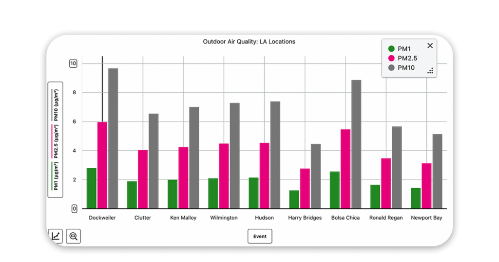
PM1, PM2.5, and PM10 readings across my nine stops around the LA basin. Dockweiler and Bolsa Chica—both directly on the beach—showed the highest PM10 values, picking up sand particles in the coastal wind.
The sensor’s built-in GNSS allows students to export GPS-tagged data from Graphical Analysis and upload directly to Google Maps™ or another GIS tool and visualize results geographically—a skill that reflects what environmental scientists and public health researchers actually do.
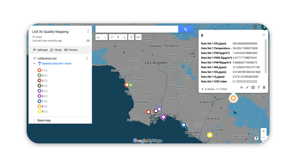
After uploading my GPS-tagged data to Google Maps, I could click each location and see the full dataset for that stop—CO₂, temperature, PM, NO₂, SO₂, ozone, VOC Index, and coordinates.
Being able to see the data geographically can add a whole new layer of analysis. Google Maps allows you to toggle between traffic, satellite, and terrain maps, and can explore how geographical elements like higher-elevation sites showed different patterns than coastal ones.
I also collected data on my flight from Portland to LA, which turned out to be its own interesting dataset. Because the sensor logs GPS coordinates continuously, I was able to map every data point from takeoff to landing.
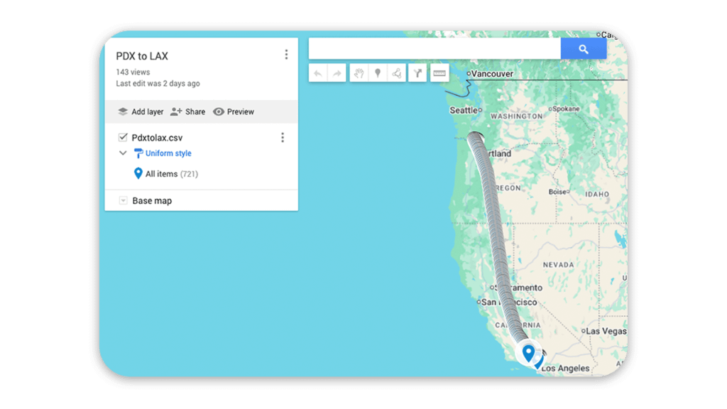
I plotted 721 data points on my flight from Portland to LA. You can trace the entire route, zoom into the approach into LAX, and follow my path through the airport to the rental car lot.
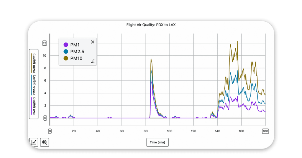
Particulate matter stayed remarkably low throughout the flight with the exception of one spike around 85 minutes in; data spiked again around 140 minutes as I deplaned and moved through the airport. This suggests the filtration system on board is quite effective.
CO₂ told a different story, running high throughout the cabin and dropping sharply the moment I stepped off the plane. Station pressure, meanwhile, tracked the entire arc of the flight perfectly.
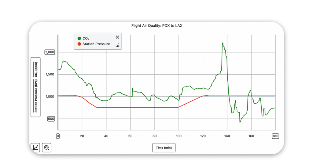
CO₂ ran high throughout the flight—peaking near 2,200 ppm around minute 135—then dropped sharply as I got off the plane. Station pressure tells the whole story of the flight: climbing out of Portland, cruising, and descending back to sea level.
This kind of multi-location, mapped investigation is something students can do at any scale—a few spots around campus, a drive through different neighborhoods, a field trip to contrasting environments. The GPS feature means the data tells a geographic story, not just a temporal one.
One thing I always encourage educators to think about: Don’t treat these as one-off investigations. A few minutes of data collection once a week from the same spot on your campus—over a semester, a year, multiple years—becomes something genuinely valuable. Students in future classes can compare their data against yours. You can map changes over time. It starts to look less like a school project and more like a real monitoring program.
Get Started

The Go Direct Air Quality Sensor is available for pre-order and expected to ship in June 2026. To see it in action, check out our on-demand webinar, What’s in the Air? Place-Based Investigations with the NEW Go Direct Air Quality Sensor.
Explore all environmental science solutions here. Have questions about Go Direct Air Quality or a wild idea for an investigation you want to try? We want to hear from you! Reach out at biology@vernier.com, call 888-837-6437, or drop us a line in the live chat.
Share this Article
Related Articles


Sign up for our newsletter
Stay in the loop! Beyond Measure delivers monthly updates on the latest news, ideas, and STEM resources from Vernier.